Cinema Responsive Website
CASE STUDY
Project overview
The product:
In addition to the mobile app, I created a responsive website homepage for the local cinema. This design is a continuation of a previous project, so I will skip user research and product ideation parts here. For details on user research, please visit previous project in my portfolio.
Project duration:
January - February 2024
My role:
Product lead, UX researcher, UX designer
My responsibilities:
User research, information architecture, wireframing, visual design, prototyping

Information architecture and sitemap
Summary:
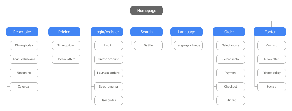
In order to organize the content in a logical and easy to use way, I first created a sitemap. The goal was to arrange strategic information architecture that would further improve the website navigation.
The website sitemap had to include full user flow, using knowledge from the previous research. For this website I chose a classic hierarchical information architecture with main pages and child pages underneath.
Wireframes and low-fidelity prototypes
Summary:
After creating the main information architecture for the product’s user flow, I started the design process by creating wireframes.
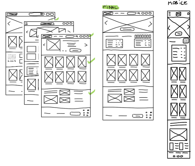
"Paper" wireframes
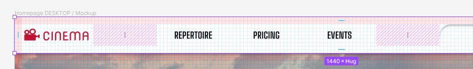
The goal was to create simple wireframes of the website's home page, showing the basic functionality. I created three different versions of a desktop page and a final, refined one including best design features from all versions. Thanks to this, I was able to make better decisions during the following design stages.
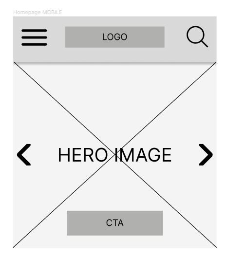
Then I repeated the process for mobile version. Naturally, with mobile version, some of the elements had to be scaled, changed or get rid of completely to increase the usability for users.
Digital wireframes
After creating simple wireframes I started designing digital wireframes in Figma. The homepage was designed to be as simple, but as functional as possible, based on findings from user research.
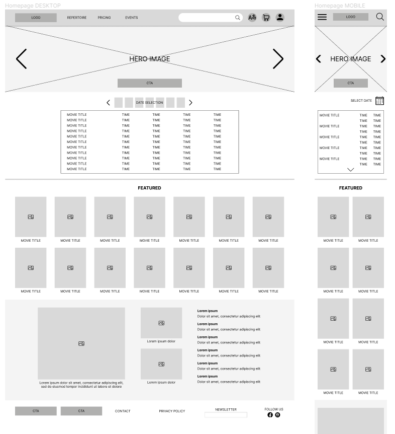
One of the differences I implemented in the mobile version was a hamburger menu. Thanks to this change I was able to fit the links in the hidden menu, increasing general usability.
Creating high-fidelity mockups and prototypes
Summary:
After low-fidelity designs have been refined and tested, I created high-fidelity mockups and assembled them into a working high-fidelity prototype for further testing and refinement.
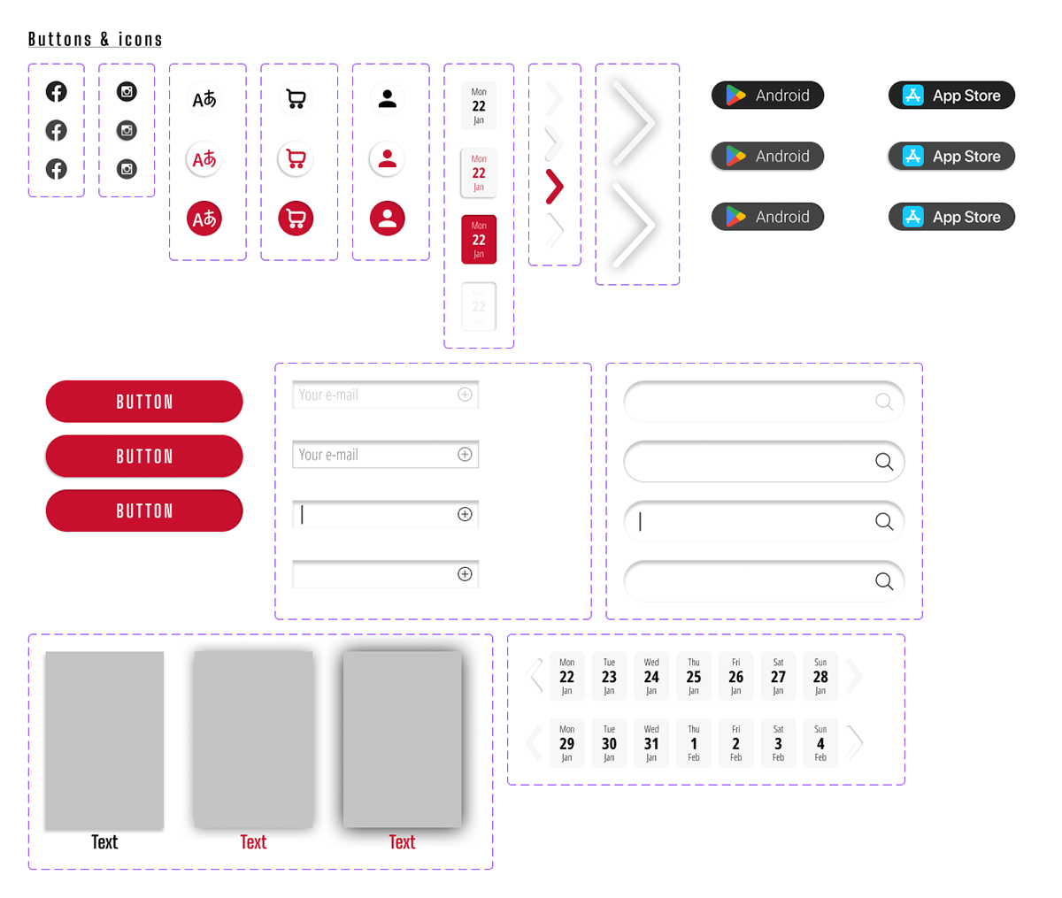
Design system
In order to maintain consistency I decided to use the design system from the app, however some of the elements needed some adjustments. I also created elements as usable components to save time. Some of these components had to be adjusted for mobile version.
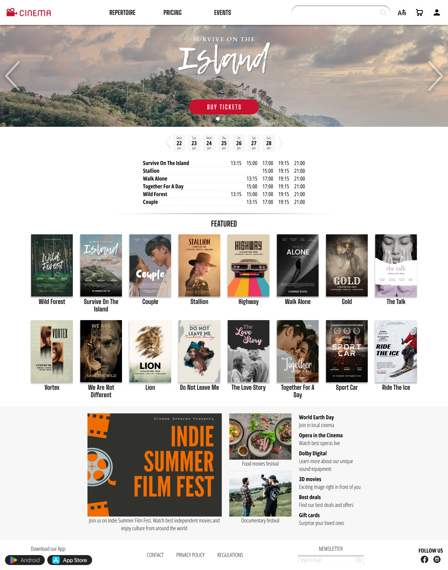
Mockups
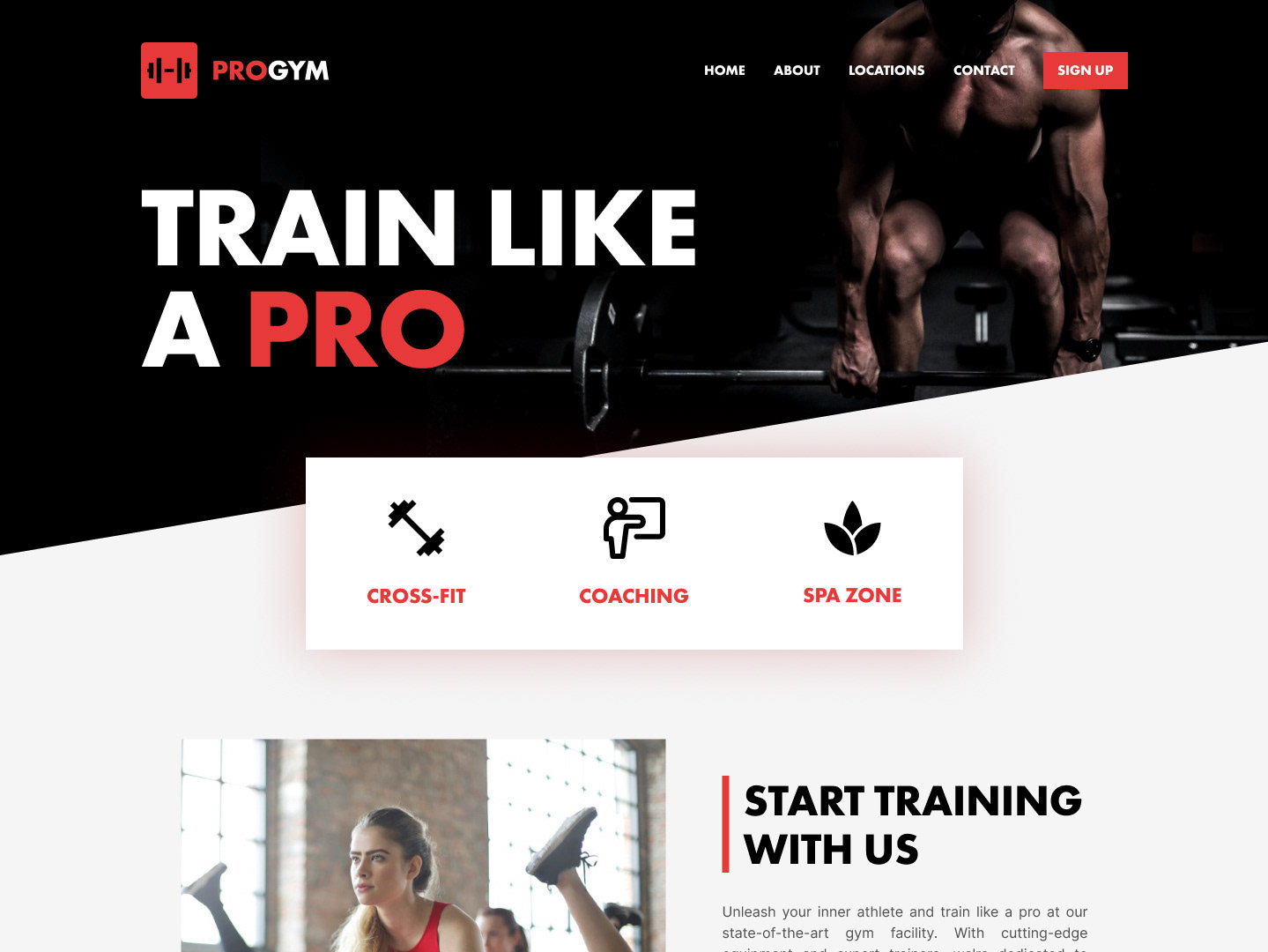
The website was to be easy to navigate and good-looking at the same time. I decided to use a large hero image to feature most popular movies with the option to quickly buy tickets.
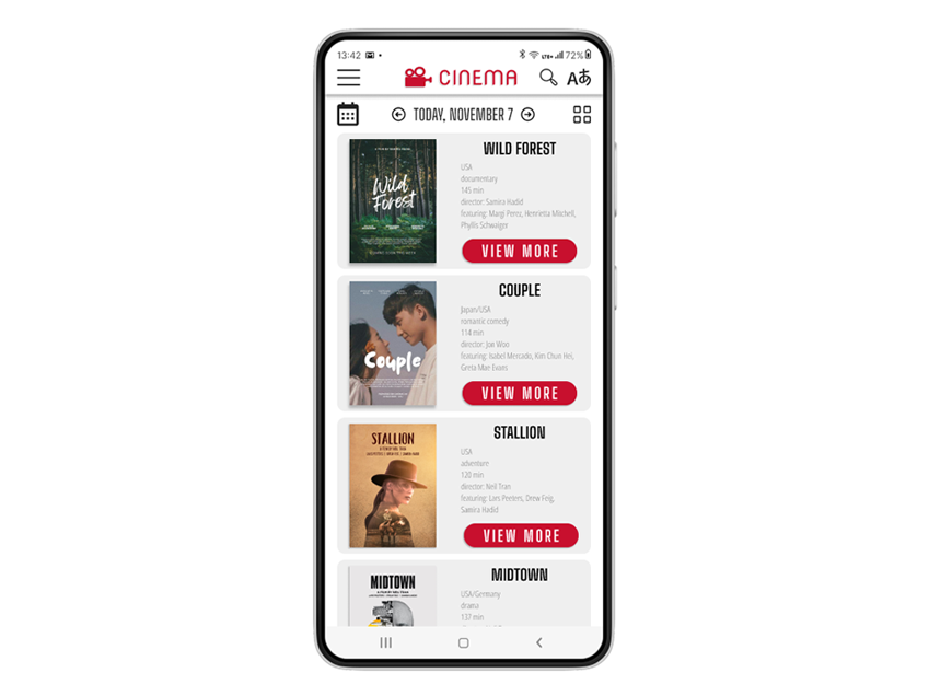
Mobile version:
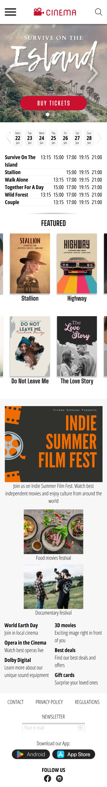
With the help of the grid, I made sure to use consistent spacing between elements of 8px, 16px, 24px and 32px or multiplier of 8px. Moreover, I grouped the elements into auto layouts in order to make them behave properly.
Some of the features I included in the design were cards with featured movies. In the mobile version these cards were made with option to scroll horizontally, to save some space.

High-fidelity prototype
After mockups were built and refined, I made the elements interactive by adding different state variants and interactions. With the help of a YouTube tutorial I was able to make hero image an interactive slider.